
SharePoint Dashboard – an essential part of Microsoft SharePoint is key to simplifying data visualization, helping businesses tap into real-time information for smarter choices.
However, creating these dashboards can be confusing, which prevents organizations from utilizing the tool to its full potential. In this blog, we’re going to talk about how you can make the most of SharePoint Dashboards and some other valuable information related to it.
Let’s begin!
What is SharePoint Dashboard?
SharePoint Dashboard is a customizable document that displays all the crucial information about any particular subject in a centralized manner. We highly recommend using this tool for a number of reasons, including:
- It helps with accurate data analysis by gathering information from different sources in one place.
- The dashboard can be customized as per your business needs for turning raw data into valuable insights.
- It has an intuitive interface that promotes seamless monitoring of key metrics for enhanced decision-making.
- With this dashboard, you can focus on critical areas of your business to improve operational efficiency.
Key Features of SharePoint Dashboard
A few useful features of SharePoint Dashboard include:
- KPI Display: The dashboard effectively presents clear, measurable, and specific key performance indicators (KPIs) like sales revenue, website traffic, etc.
- Graphical Data Representation: With these dashboards, users can create graphical summaries of data for better visualization of key metrics.
- ERP and Accounting Integration: For cross-functional data integration and financial reporting, these dashboards collaborate seamlessly with Enterprise Resource Planning (ERP) Software and other accounting systems
Pros of SharePoint Dashboard
Here are some of the key advantages of SharePoint Dashboards:
- Enhanced Data Accessibility: SharePoint Dashboards centralize data, making it more accessible for businesses seeking simplified decision-making.
- Customization: Data presentation can be tailored to suit the specific needs of different departments or individuals.
- Improved Productivity: Easy access to charts, reports, and tasks boosts employee productivity by enabling efficient project completion.
Cons of SharePoint Dashboards
Although SharePoint Dashboard is a popular choice for businesses, there are some downsides to using it, including:
- Expertise Required: It can be complex to customize the dashboards for beginners as it requires technical expertise.
- Limited Mobile Responsiveness: Some SharePoint Dashboards may have limitations in providing a seamless experience on mobile devices.
How to Create a Dashboard in SharePoint?
This step-wise guide will help you make a custom and easy-to-use dashboard on SharePoint easily.
How to Plan Your Dashboard
To plan your SharePoint Dashboard effectively, you should:
- Set Clear Objectives: Define the purpose and goals of your dashboard.
- Identify Data Sources: Determine where data will come from (SharePoint lists, external databases, etc).
- Select Key Metrics: Choose specific, measurable KPIs aligned with the objectives of your project.
- Design Layout: Plan the structure and arrangement of web parts and visuals.
- Choose Visualizations: Select appropriate chart types and visuals for data representation.
Step-by-Step Guide on How to Create Sharepoint Dashboard
To get started with SharePoint Dashboard creation, you should:
- Sign in to your SharePoint account.
- Navigate to the “Site Contents” page of your Team Site where you want to create the dashboard.
- Locate and click on the “Add an App” link.
- Select “Dashboard” from the provided list of options.
- Assign a name to your dashboard and then click “Create.”
Web Parts
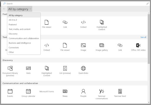
Web parts can be very useful in customizing your Sharepoint Dashboard. To add these elements, follow the below steps:
- Once the dashboard page loads, use the “+” button to insert a new web part.
- Choose the type of web part you wish to incorporate into your dashboard, such as a list, document library, chart, or map.
- Customize the settings to tailor it to your specific requirements.
- Save the changes, and your dashboard is now fully configured and ready for use.
- To make the changes visible to others, publish the page by clicking on “Save” or similar options, depending on your SharePoint version.
Now, you can access these custom web parts on similar pages you create in the future.
Data Sources
Before we dig deeper into how to add data sources on SharePoint Dashboard, let’s discuss a few data parts that can help you achieve maximum efficiency for your business. It particularly includes KPIs, lists and libraries, task progress bars, document sets, quick links, etc.
Here are the steps that you need to follow to add data sources to your SharePoint Dashboard:
- Navigate to “Data Sources” in the left sidebar.
- Click the “Create a New Data Source” button to proceed.
- Choose “Microsoft SharePoint” on the “Where is Your Data?” page.
- Select an existing connection from the drop-down menu and click “Continue.”
- On the “Configure your Connection” page, pick the desired Microsoft SharePoint Site and click “Get Data.”
- Verify if it’s the right data and click “Continue.”
- Provide a name to the source, select refresh settings, and share the data source with your team members, if required.
- Finally, click “Save.”
How to Customize a Dashboard in SharePoint?
The customization of the SharePoint Dashboard can be done using useful tools like Report Builder and Custom Code. The below guide will help you make the most of these.
Create Strong Reports Using Report Builder
Report Builder empowers businesses to build customized, insightful, user-friendly reports that can be integrated easily with a SharePoint Dashboard. Here’s how to use it:
- Launch Report Builder from your SharePoint Site. It’s similar to Microsoft Office and lets you make reports in different layouts like tables, charts, etc. You can use any data source from your SharePoint Site to build these reports.
- Save and publish your report to the SharePoint Library once it’s ready for web browser access.
- Select the saved report and click the ”More Options” tab to obtain the Embed Code by ”Embed Information”.
- Back on your dashboard edit page, navigate to the ”Insert” tab in the Ribbon and select “Embed Code.” Finally, paste the code you have copied earlier and click ”Insert” to complete the process.
Enhancing the Design With Custom Code
Here’s how you can make the most out of your SharePoint Dashboard’s visualization with custom coding:
- Start by navigating to your dashboard and clicking the “Edit” button.
- Go to the “Insert” tab in the Ribbon and select “Web Part.” Under “Media and Content,” choose “Script Editor” and click “Add.” This action adds a Script Editor web part to your dashboard.
- Now click the “EDIT SNIPPET'” link and paste the custom code in the dialog box that appears on your screen. After doing so, select “Insert”.
- Remember to save your changes once the custom code is integrated.
Best Practices For SharePoint Dashboards
Following a few best practices can make SharePoint Dashboard management much easier than before. Let’s explore them:
- Keep It Simple and Focused: The dashboard should be easy to understand. This can be done by using clear visuals and filters for easy data access. Moreover, it’s equally important to avoid overloading the dashboard with too much information and ensure neat organization of the content.
- Prioritize Key Information and KPIs: Effective dashboards should highlight the most important information and key performance indicators (KPIs) that align with your business objectives.
- Responsive Design: Ensure that the dashboard is responsive to various screen sizes and devices. SharePoint Dashboards should be accessible and functional on desktops, tablets, and mobile devices.
How to Create an Effective SharePoint Dashboard with Excel
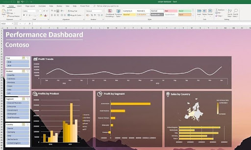
Follow these steps to create a Sharepoint Dashboard with Excel.
- Open Excel on your computer and pick a blank template.
- Click the “Data” icon at the top.
- Select “From Other Sources” to make an external group.
- Choose “From OData Data Feed” in the list.
- In the “File or Link” box, add your list-data.svc URL. This URL looks like https://mysite.com/_bin/-listdata.svc, with “mysite.com” being your SharePoint site.
- Click “Next” on the connection wizard.
- If asked, sign in with your username and password.
- Pick a list from the options in the data connection wizard.
- Click “Next.”
- Hit “Finish” to close the connection wizard. On the import data screen, choose “PivotChart” and click “OK.”
If you did everything right, you’ll see a small blank chart in Excel. On the right, you can find the “PivotChart Fields” window with all your SharePoint list columns.
How to Simplify SharePoint Dashboard Visualization
For better data visualization, businesses can use templates or charts that help simplify the overall dashboard presentation. Here’s how it’s done:
Adding Charts to Dashboard
Adding charts to your SharePoint Dashboard makes it easier to understand trends and patterns at a glance. Let’s understand how to do so:
- If you’re not in edit mode already, tap “Edit” at the top right of the page.
- Hover your mouse above or below an existing web part or under the title section.
- Click on the circled plus sign to add a modern web part to your page.
- Select the “Quick Chart” web part.
- To give your chart a title, click on it, and you’ll see an option to name it.
- Click the “Edit Web Part” button to configure your Quick Chart’s settings.
- Choose the type of chart (column chart, Pie chart, etc.) you want from the toolbox on the right side.
- In the “Data” section, decide whether you want to enter data manually or retrieve it from an existing SharePoint list or library.
- Format the chart by adding data sources from your chosen list or library.
- Make sure that the information in the “Column that Has Data to Display” section contains numerical values for the Quick Chart to work correctly.
Utilizing Templates
Using templates in SharePoint can simplify dashboard creation by providing pre-designed layouts and structure. You can use them by following the easy steps given below:
- Begin by creating either a Communication Site or a Team Site, depending on your needs.
- Navigate to the Settings to access various customization options.
- Look for the option called “Apply a Site Template” and click on it.
- Choose a template that aligns with your organization’s requirements.
- Finally, click “Use Template” to apply it to your site.
- Explore your newly customized site and double-check the existing content in “Site Contents.”
- If you’ve made changes to the site, remember to republish them. This ensures that the new content is available to viewers.
Empower Your SharePoint Journey with SharePoint Support
SharePoint Support stands out as the top choice for businesses aiming to enhance collaboration, improve content management, and customize workflows. Our goal is to boost productivity and teamwork by providing tailored solutions, ensuring your organization grows in the digital landscape.
We offer expert SharePoint consulting, migration, training, and project management, helping you fully utilize SharePoint’s potential. So, why wait? Let’s team up and embrace the future of efficient teamwork and innovation together with SharePoint Support!